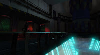
Really fast update concerning my scene, I'm adding some of the extra assets that will make the environment more believable, I got a little bit sidetracked by scripting the Pacman kismet game but this will get back in track soon enough.
I might have to tone down the volume fog a little bit. Some of the opacity on the glass isn't working properly but I believe that's an issue with the blend translucent mode so I might have to make that a submaterial.
Tuesday, October 29, 2013
Monday, October 28, 2013
UDK Pacman
After dealing with quite a bit of technical issues and tons of research (The time I spent on research easily surpasses the time I spent on the scripting part) I finally completed this.
It was quite the learning experience, I'd love to add power ups, a fancy HUD, randomly spawning fruits, and overall polish some details here and there but for now this works as intended.
It was quite the learning experience, I'd love to add power ups, a fancy HUD, randomly spawning fruits, and overall polish some details here and there but for now this works as intended.
Tuesday, October 22, 2013
Senior Project II - Week 4
Here's some quick paintovers of the scenes in different lighting situations
And here's some of the fully textured assets in the environment along with their diffuse map, there's some small issues with lightmaps that will get sorted out.
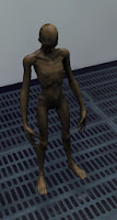
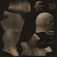
Finally, some detail maps have been implemented to the assets to increase the amount of detail without havig to reply on huge texture files.
And here's some of the fully textured assets in the environment along with their diffuse map, there's some small issues with lightmaps that will get sorted out.


Monday, October 21, 2013
Scripting WIP
So now for a small change, this is some of my progress for the Intermediate Scripting class, I'm trying to recreate Pacman in UDK. Collision and visuals (An emissive shader that pulses and cycles through different colors) are mostly done. The camera is all set too. The challenge now is to entirely change they way the game was set, initially I was using the default UT Deathmatch player with bots but the controls were rather inconvenient and the bots aren't working properly so I'm most likely changing the way things are set right now.
Tuesday, October 15, 2013
Senior Project II - Quick comparison shots
Sunday, October 13, 2013
Senior Project II - Another revision to lighting and some extra stuff
The scene has been updated with some extra lights to make the composition more interesting.
A subtle dominant directional light and lightmass volume were added to have some subtle shadows and light the scene up a little bit. A point light was added near the bottom of the environment to simulate the light from the emissive and simulate some sort of rim light.
Other than that some minor adjustments were made to the rest of the lights and emissives (mainly the green elements from the chambers) to find the right balance, some static meshes weren't lit properly before due lack of lightmaps but that issue has been addressed.
Another element that was added (and it might be too subtle to notice) is a plane with a fog shader placed a unit above the floor, again, to make the composition more interesting.
At this point the basic lights are pretty much done, the next step is to make the rest of the adjustments from feedback I received during class.
Tuesday, October 8, 2013
Senior Project II - Lighting and Composition update
Here's another quick update, there's some additional tweaks to the lighting just to give a general idea of what I'm aiming for, this isn't final (The generator will have quite a bit of emissive, same for control panels and possibly some of the railing)
I might move that door a bit closer to the camera or tweak that railing, just to make it more visible, this is still missing quite a big of greeble, cables and other details, but those will be added over time.
Sunday, October 6, 2013
Senior Project II - New camera angle and lighting update.
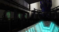
A quick update to the senior project environment, this screenshot is using the new camera angle, some elements were repositioned or expanded and most elements from the paintover are in.
I'm still playing around with the lighting, I want the emissives to stand out but I don't want the environment to be too dark and lose focus from the hero props. A bunch of assets are fully textured but these might see some changes to unify the final look of the environment.
Tuesday, October 1, 2013
Senior Project II - Paintover and general project update
A quick update to the environment, the camera angle has changed to reduce some of that negative space and some small props have been added (pipes, stairs, more railing) to give the environment more of a functional look, the missing generator has been added, the ceiling above the generator has been expanded upwards to emphasize the scale of the generator, the pipe/wiring that connects the generator to the rest of the environment has been placed below the glass too.
The next update will be focused on the redesign for the columns and quite possibly some design ideas for the new railing piece and stairs.
The floor and walls will be changed for sure (That will be saved for a later update), they'll have more of a sci-fi look (They keywords/ideas I have so far are metal, grates and wiring, of course these will be modular but at the same time I'll try to keep them as interesting as possible)
Everything is already imported into UDK, so I'll also be dealing with common issues and troubleshooting (Lightmaps, material and shader issues, seams, etc.)
Senior Project II - First post
Over the following weeks I'll keep this blog updated with concepts and progress related to my senior project.
My environment is a Biolab/cloning lab with aesthetics slightly based on Metal Gear Rising.
This is the initial concept for some props, the shape of the test tubes/cloning chambers changed over time to make them more interesting, the initial concept was supposed to have the chambers embedded into the wall but it was later changed to a more traditional but also more interesting shape.
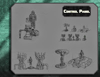
The generator and control panel will be reworked on through the course (And additional control panels are being worked on, these will be embedded into pillars that will separate the cloning chambers)
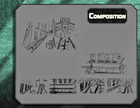
The composition and layout is for the most part the same, not counting the updated design for the cloning chambers, more additional props will be placed through the environment to balance the amount of negative space.
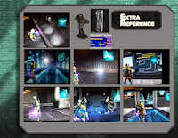
Some reference material for visuals, textures and shaders.
The initial concept for the cloning chambers was modular:
My environment is a Biolab/cloning lab with aesthetics slightly based on Metal Gear Rising.
This is the initial concept for some props, the shape of the test tubes/cloning chambers changed over time to make them more interesting, the initial concept was supposed to have the chambers embedded into the wall but it was later changed to a more traditional but also more interesting shape.

The generator and control panel will be reworked on through the course (And additional control panels are being worked on, these will be embedded into pillars that will separate the cloning chambers)

The composition and layout is for the most part the same, not counting the updated design for the cloning chambers, more additional props will be placed through the environment to balance the amount of negative space.

Some reference material for visuals, textures and shaders.
The initial concept for the cloning chambers was modular:
And this is the new version of the cloning chambers.
And this video shows an early version of the shaders used in an early version of the environment. The pipe is completely gone and will be replaced with something that makes more sense, environment-wise (Metal pipes and cables that will power up the generator)
A more updated version of the environment, the floor and wall textures are being completely replaced, the columns are being reworked on right now, there's one placeholder (The platforms around the missing generator) and there's a lot of adjustments that will be implemented over the course of the next weeks (Lighting, light functions, tweak the placement of some assets, as well as adding more small props and details that will make sense design-wise), this time assets and certain elements will be worked on individually instead of working on all the elements at the same time and wasting time on shaders.
Subscribe to:
Comments (Atom)


